Where do the Dashboard data come from, and why does data sourcing matter?
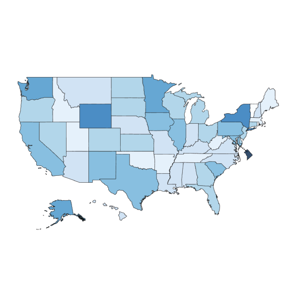
The Dashboard profiles, comparisons, and visualizations all reflect data reported by local school districts—these data are what school districts reported about their actual facilities spending. Of course, district leaders want to know – we all want to know – what’s being invested and whether we’re doing all we can to make sure our public schools are safe, healthy, and enriching places.
Likewise, for those of us who study school facilities and facilities spending, the district is the unit of analysis. It’s where the money gets spent. So when you look on the Dashboard at a state-level spending figure, I think it’s meaningful to know that that figure is built up from district-level data throughout the state. It’s not that we have district figures and, from somewhere else, a state figure. Everything on the Dashboard is built from district-reported data.
There is no federal database or other national database on public K-12 school facilities, but all the data on the Dashboard are drawn from public sources, namely the U.S. Census and National Center for Educational Statistics surveys. Those agencies work hard to ensure the data are accurate. With so many different local school districts reporting their own data, there will inevitably be variability, and some gaps in what’s reported. But NCES goes back and forth with districts to make sure the data are as accurate as possible. That’s why the most recent data in the Dashboard are from the 2021-22 school year: there was a lot of quality-checking, and that takes time. This is the most recent year available; we plan to keep adding data each year as it gets released. So the dashboard will always be up to date.
Local control of public schools means that facility decisions are made by district leaders and reflect local circumstances. But what common patterns and issues do the data reveal for districts and states throughout the nation?
Elementary and secondary schools are an enormous sector of public infrastructure, and there’s so much in common across states and districts, so many common issues. But because the responsibilities are local, we seldom get to see school facilities data combined and analyzed nationally, or even by state. Without a national database, common conditions and challenges are not easy to recognize or share, nor are the common kinds of efforts that districts undertake. We lose insights from all those experiences that have to be learned and relearned.
I also think it’s important to recognize that these are spending data, not data that are directly about the characteristics or the condition of the school facilities. We’re using fiscal and enrollment data to build a model of reality, and of course, that’s going to be complicated. You have to look for evidence in the data that can tell you about the thing itself.
For example, one of [NCSI Consortium Director] Jeff Vincent’s research findings, from his work in California, is that very low-wealth districts and very high-wealth districts both spend a lot on facilities maintenance and operations, compared to the average. But, in the impoverished districts, it’s often because they don’t have the capital dollars to spend [on construction and renovation], so they have to make emergency repairs as old things break or fail. For example, they might repeatedly patch a roof that leaks instead of replacing the whole roof at the end of its recommended lifecycle. This is where the spending data can give you some grist, some prompts to look more deeply into what’s happening with your buildings.
With 27 years of spending data, the Dashboard offers a long view. Talk to us about why NCSI believes that’s the best way to frame a conversation about school facilities.
In the capital funding world, what you’re doing should be lasting work. The whole idea is that the school is going to live in the community over generations as an ongoing asset to that community. So if you’re trying to understand infrastructure requirements and make sense of a district’s investments, then longitudinal data are essential.
Part of what drove me to work on school facilities initially was the condition of my own children’s school. I thought, ‘Oh my gosh, the community built this school in 1926, and now we’ve used it up.’ It was in terrible condition. Then I thought, ‘What about my generation, what are we leaving for our children and grandchildren?’ For me, presenting these longitudinal data is a way of inviting people to think in bigger blocks of time, to ask, ‘What are we going to do in the next generation? What’s the next 27 years?’ After all, that length of time is essentially a generation.
Those are some of the reasons why the Dashboard shows spending data both in actual dollars and inflation-adjusted dollars, and it allows you to track changes in year-to-year enrollment. Those features help put the spending figures in that long-term perspective.
For one thing, you can check and compare your level of effort over the years. In actual dollars it may look like spending was increasing, but when you adjust for inflation you may find that really wasn’t the case. Or, let’s say you see major capital spending over certain years. If there was also strong enrollment growth, then that spending may reflect new school construction to relieve crowding, but it may not indicate there was renovation and improvement in older school facilities.
The Dashboard is intended to be a dynamic tool that responds to users’ interests. Beyond spending data, how do you see the Dashboard evolving?
There is a dearth of data on the physical characteristics and conditions of school facilities. A key missing point that would complement the spending data is the square footage of school buildings in a district. The current Dashboard includes the number of students and the number of schools, but not the actual extent of buildings and grounds, in square feet or in acres.
Especially if we also knew the age of the buildings, then putting size, age, and spending together could do much more to describe or suggest the likely condition of schools – more than just spending alone.
The importance of outdoor educational space and community space is coming to be recognized and appreciated much more, and if we had all those kinds of site data, then users could look into questions like: ‘How much of our facilities acreage is covered by the building footprints? How much area is hardscaped, and how much is softscaped?’
A truly comprehensive school facilities database could also give users data on major building components and systems. Types of heating and cooling systems, for example.
We are working now to incorporate data on utilities spending into the Dashboard. School districts have been reporting those figures to the U.S. Census of Governments since 2015, and I think the information could be very useful for district or state leaders. For example, you could consider utility spending as a percentage of all your maintenance and operations spending. We see a lot of variability from district to district, even in similar types of districts. If district leaders could compare their data, they might say, ‘Wait a minute, how come this other district isn’t paying as much as we are? How could we learn from them?’
For as many answers as the Dashboard data can provide, what would you say is the most valuable?
The Dashboard can give people a lot of information and hopefully can prompt really valuable thinking about their own state, their own district. But it’s not so much about drawing conclusions. The Dashboard is so valuable for generating questions for closer investigation and reflection. To me, a benefit of visualizations like these is to give some common context for broader conversations.
For one thing, the Dashboard can help anyone to see their own facility spending, whether that’s in a district or a state, on a relevant scale. I believe it’s valuable for anyone to know what’s being done to maintain school facilities where they live and what’s being invested in capital projects in their community. Then you can look at those figures comparatively, and ask, ‘Actually, how much is that? Is it a lot? Too little?’
It’s also significant that the Dashboard lets you look at spending on a per-student basis as well as the total spending. In large urban districts or at the state level, especially, the sheer numbers are so big, it’s easy to just say, ‘Wow!’, and maybe leap to a conclusion that all the schools must be in good condition because so much money was spent. The Dashboard puts those numbers into useful contexts. You can see the national context, compare similar states or similar districts, compare what’s being spent on capital projects or on maintenance and operations – all on a per-student basis. As I see it, a key responsibility of public sector decision-makers is supporting fairness, and for that you really need to consider per-student data.
Overall, I think the Dashboard empowers local leaders, state leaders, and even interested community members or parents with a powerful new tool to have smarter discussions about how to ensure their school facilities are the best they can be, for now and for the next generation.


